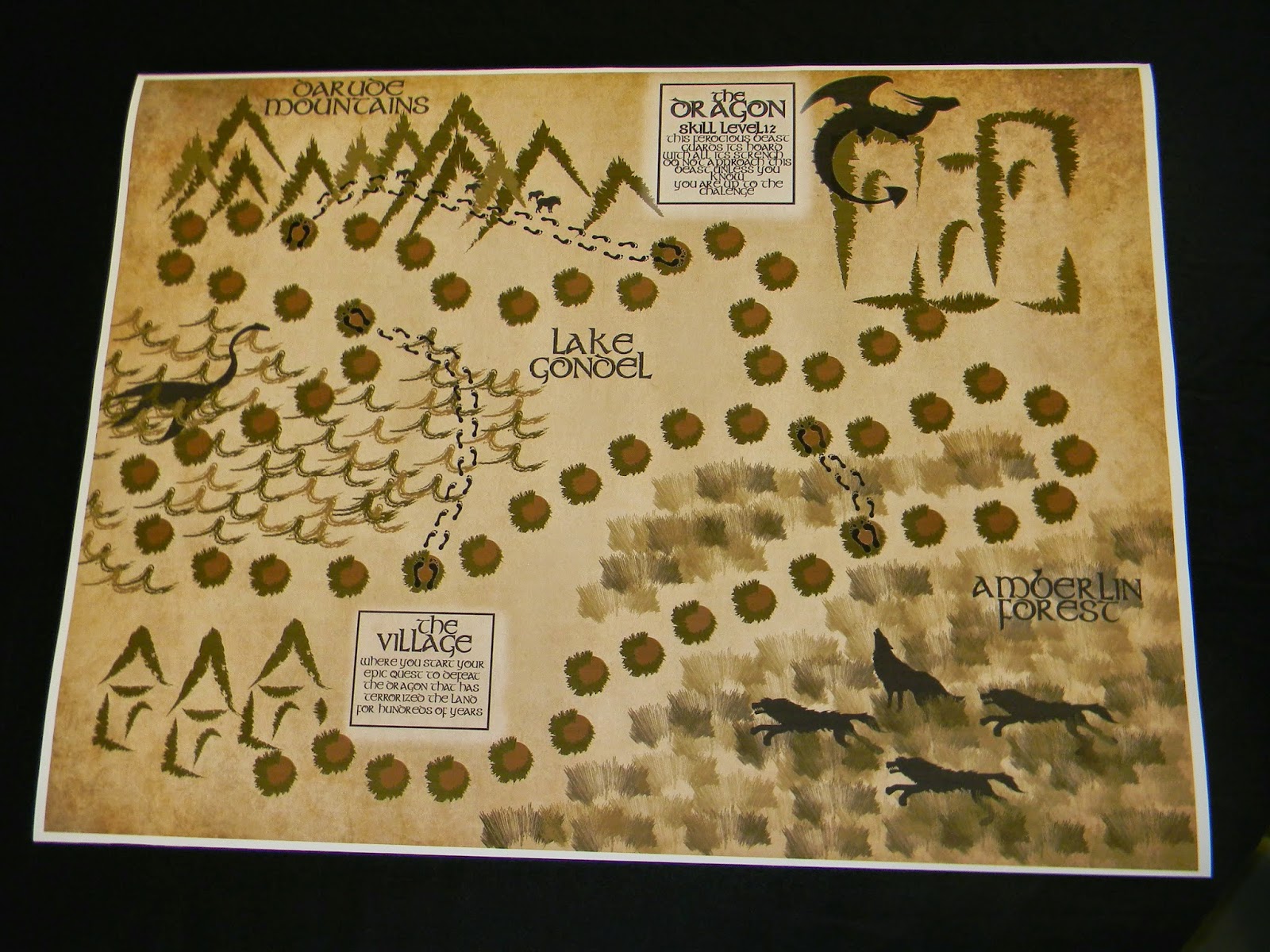
Age of Adventure a fantasy Adventure Board Game Created by Colleen Jennings, Rachael Waldroup, Caitlin Brown, and Christiana Broughton
Sunday, April 13, 2014
Board Game Group Project: Age of Adventure
Age of Adventure a fantasy Adventure Board Game Created by Colleen Jennings, Rachael Waldroup, Caitlin Brown, and Christiana Broughton
Sunday, April 6, 2014
Chicago: The Muscial Poster

The poster Chicago was made for the 1996 showing of Chicago the Musical, the longest running musical revival. The Poster features black and white photography done by Max Vadukul of the sexy main characters from the show as well as the most eye catching part of the poster the big red "Chicago". The combination of the black and white and the bold red brings out the over all feeling of the play which I fine very interesting.
Margo Chase
Margo Chase graduated school with a degree in Biology along with experience in medical illustrations, in 1986 Chase founded a design group that helped to translate her interest in gothic architecture and medieval manuscripts into a successful business. In the late 1990s Chase created dozens of typeface her most notable type faces were created for famous singer Madonna and popular tv show Buffy the Vampire slayer. What caught my eye about this designer was the logo for Buffy the vampire slayer as well as several other typography logos the designer had done, I realized I've been a fan of her work for a long time I like the use of her bold black lines the have minimal subtle details to make them distinctive.
Sunday, March 30, 2014
Light Years
Light years was a poster designed by Michael Bierut for the Beaux Art Ball in 1999, using evenly spaced Translucent letters. The most interesting thing about the design are the white shapes that are made by the two translucent words overlapping each other creating visual interest while also having the words still be legible. I almost feel as though "Light" was being represented with the white areas created by the overlapping effect and the "years" was being represented by the fading look of the words.
Luba Lukova
Luba Lukova was born in Bulgaria and graduated from the Academy of fine arts in Sofia Bulgaria in 1986. Upon visiting New York in 1991 Lukova decided to stay in the united states and have permanent residence in New York, she was hired by the New York Times Book Review. Lukova is best known for her illustrations and design work.
I chose Luba Lukova to discuss because I was drawn to how simplistic nature of Lukova's illustrations. The artist uses blocky shapes, very minimal thin lines and a basic color scheme that sets up the mood for the image. The illustrations and the content makes the viewer take a second look to see the full message conveyed. I really enjoy the surreal nature of the images.
Monday, March 24, 2014
Dylan
Dylan was a poster created by Milton Glaser released in 1967 for Bob Dylan's Greatest hits, it featured a silhouette portrait of Bob Dylan with colorful and swirl designed hair. I love the contrast of the black blocked out silhouette and the swirls of colors, the swirls remind me of the rhythm of music and acts as symbolism for the concept of thought.
King Kong and Godzilla
The design I chose is entitled King Kong and Godzilla, it was a commemoration of the fortieth anniversary of the atomic bombing of Hiroshima. I find this piece really compelling because of the iconicism of the characters King Kong and Godzilla, both characters are symbols of destruction one for the USA and one for Japan and both characters are well known and loved throughout the movie watching world. To portray these characters holding hands instead of their traditional rampage is a clear symbolism of peace and unity of the countries they represent and I personally just think it was a highly clever way to use these characters.
Subscribe to:
Posts (Atom)